FirstMet
TL;DR 😉
My Role
Senior Product Designer
Date
March 2018 - Dec 2018
Company
Snap Interactive
What I Did
- Lead UI/UX design
- Discovery & requirements gathering
- Prototyping & wireframing
- High fidelity mockups
- A/B and usability testing
- Product scoping & management
Tools I used
Sketch, Photoshop, Illustrator, After Effects, Origami
Who Helped Me Do It
Niki Larsen, Jason Dove, Botond Denes, Matthew Broodie-Stewart, Alex Rose
What's it all about!?
FirstMet (formerly Are You Interested?/AYI) was one of the first facebook connected dating apps. After 10 years, the company found itself in a crowded dating space and needed to find ways to stay competitive. The user experience remained relatively unchanged in 10 years. User’s often found the experience dated or hard to navigate compared to simpler, contemporary products. So, we set out to change that.
I lead Product and UX design for a new core experience. We explored ways to make things simpler and more engaging. Initial A/B tests against control showed a 30% increase in user engagement, with user’s sending 10% more “likes”, and 20% more messages.
01 Discover
So, What's the problem?
Problem 1: Dated
Although we were always A/B testing new features, the core experience and interface of FirstMet had not changed in over 10 years. User’s found it dated compared to competitors.
Problem 2: Staying Competitive
FirstMet was having trouble retaining users. The dating space was now super saturated with competitors whose interfaces were more modern and simple.
Problem 3: Where is it?
10 years of feature testing had created some bloat and odd user journeys. Users found the experience hard to navigate at times.
01 Discover
Did you do your homework?
Stakeholder Interviews
First I met with the Product Manager and executive stakeholders to determine project scope, manage expectations, and determine success metrics.
Data Analysis
With the help of the Business Insights team, we gathered and analyzed current engagement data to set baselines and find areas for improvement.
Competitive Analysis & UX Inspiration
I completed audits of competitor experiences and those of similar apps to find inspiration and key differentiators that we could focus on.
Usability Testing & Surveys
We conducted usability testing to gain insights and feedback on the current experience and find friction points. Users were asked to complete the sign-up process and then perform certain tasks such as liking another user and sending a message. Their experience was screen-recorded, and they were asked to complete a set of questions immediately afterwards. This feedback was evaluated and turned into actionable items. We also met with the customer service team, who provided common customer complaints about their experience with the app.
02 Plan
A plan for everything
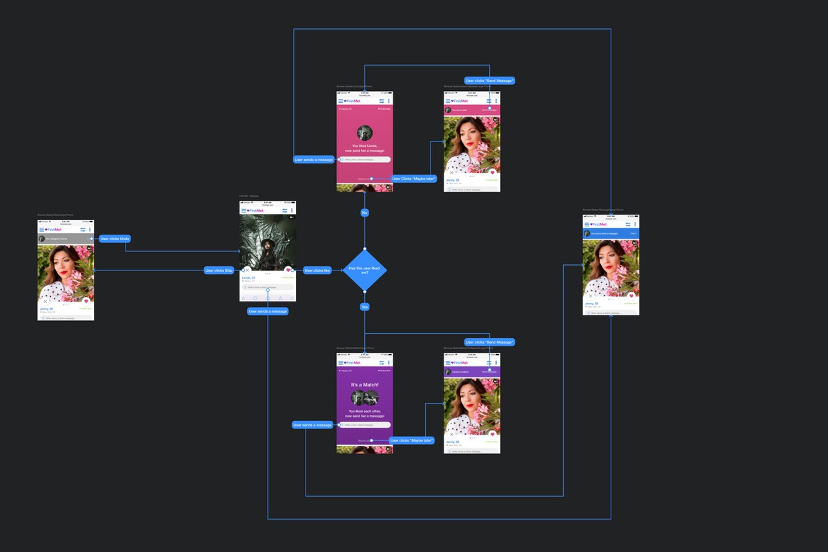
User Journey mapping
Everything about the current experience had been finely tuned and optimized over 10 years of constant A/B testing and iteration. It was important we mapped and understood the current flows. We needed to maintain or improve certain engagement triggers, especially for premium users, to avoid hurting engagement metrics.
Wireframing
I began exploring solutions for different parts of the user experience including the main browse section, user profiles, and messaging. I then met with the Product Manager to review and refine the proposed concepts.
Development and Analytics Requirements
After refining the planned user experience, we met with the dev team to determine feasibility and scope, start planning development, and audit what analytics data we would need to collect for later analysis.
03 Design
Design & Prototyping
I began refining our wireframes into high fidelity concepts and prototyping user flows. The objective was to give the app a more modern, easier to use interface and implement our new branding, while maintaining some of the existing engagement cues central to our user engagement model. I also explored how micro-interaction driven animations could provide users with positive feedback and keep them engaged.
03 Design
Browse
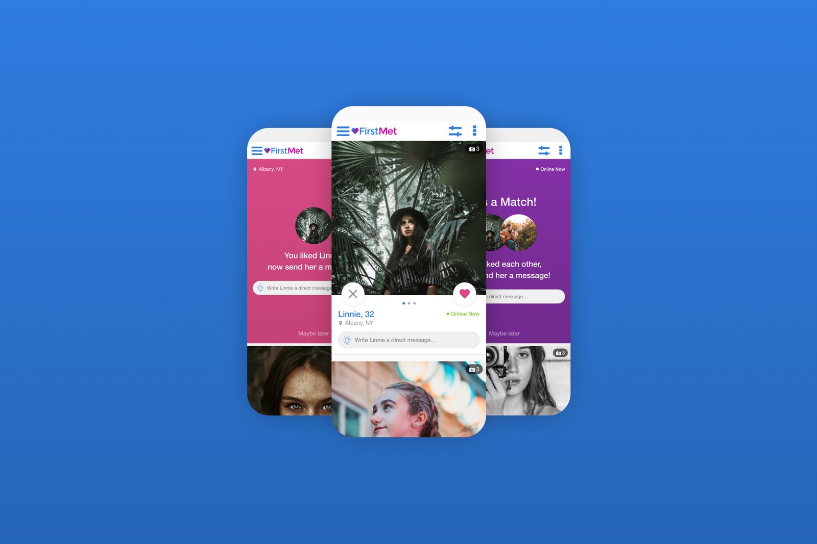
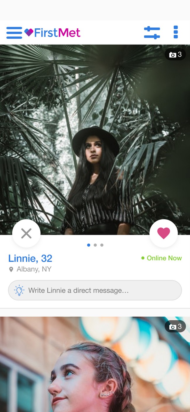
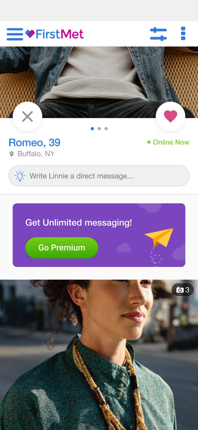
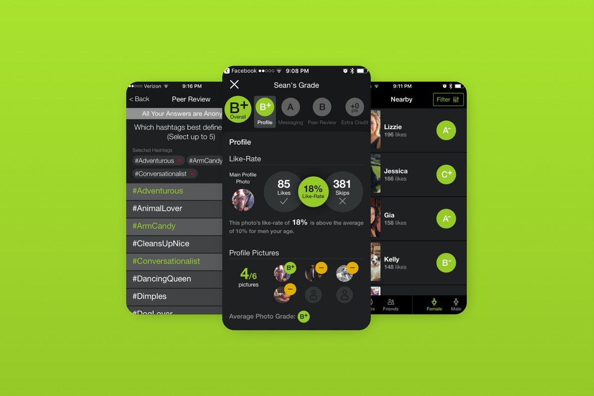
The browse feed is the core experience of most dating apps. FirstMet’s existing browse was adapted from desktop, and optimized for early, antiquated mobile devices. The pictures were tiny, and pushed to the side by giant skeuomorphic buttons. Pictures are one of the most important parts of a dating profile and our user testing indicated users wanted bigger pictures. I focused on bringing profile pictures to the forefront, modernizing the UI, and better utilizing the available screen real-estate.
Since dating apps are a form of tailored social network, we thought it might be interesting to introduce a scrolling feed. Instead of viewing profiles one-by-one, a user could scroll and take actions on several profiles at once. We A/B tested this concept along side a traditional one-by-one view and the current control.
03 Design
Profile
Dating profiles, though often sparse, can potentially contain a lot of content. Our app was facebook connected so it could potentially pull in things like your favorite movies, tv shows, and more. I had to account for profiles being empty, and profiles loaded with content. I focused on cleaning up the informational hierarchy, while also introducing larger images like in browse.
03 Design
It's a match!
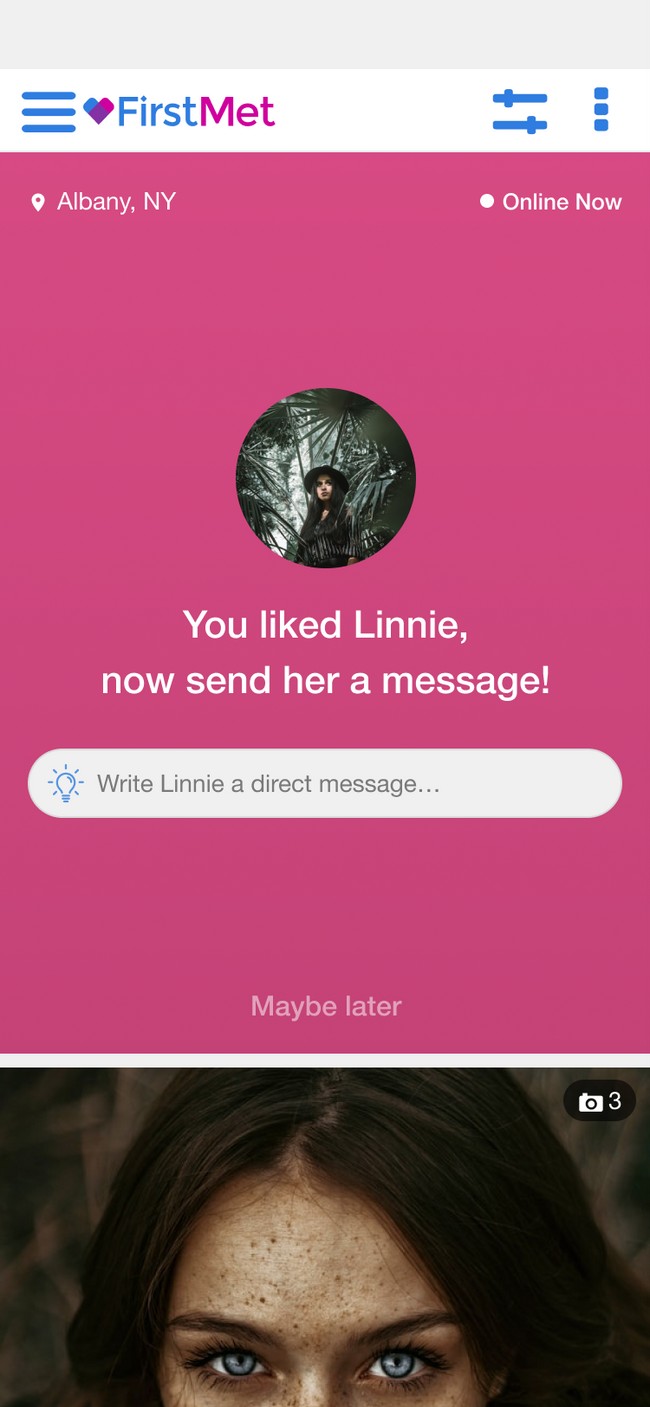
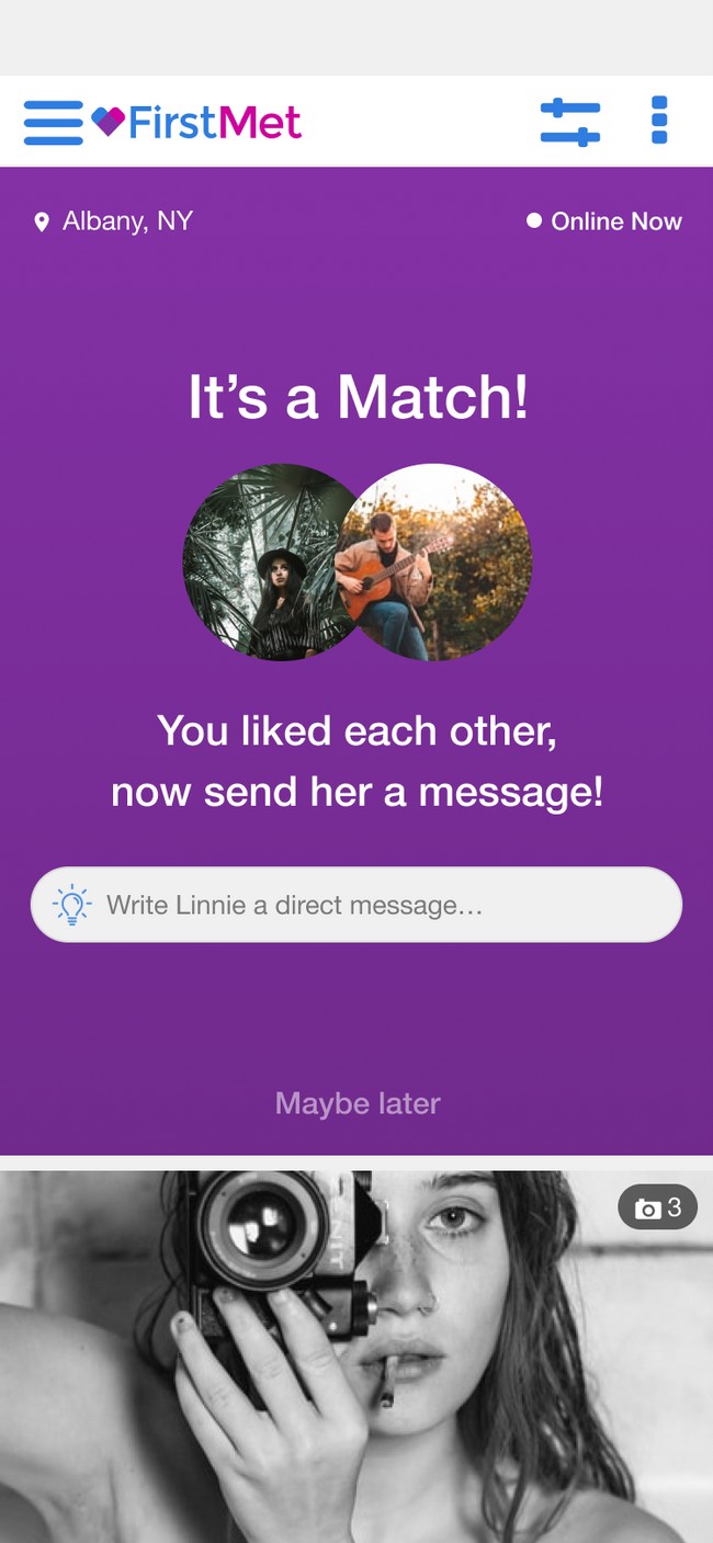
The “match celebration” is one of the biggest drivers of engagement in the app. I tried to elevate the serotonin-inducing experience by introducing playful animation, and bringing a friendlier tone with a brighter cleaner design
04 Build/Test/Review
Testing 1,2,3...
Scoping & Dev Handoff
After finalizing designs and creating prototypes I then prepared spec documents, icon fonts, packaged everything up, and worked with the product manager to scope and schedule the features for development.
A/B Testing
The Scientific Method and feature testing were at the core of everything we did at FirstMet. Every change to the app was based on developing a hypothesis, testing it, and analysing the results. The new experience was launched as a split A/B/C test. The A group saw the new experience with a scrolling feed. The B group saw an updated one-by-one experience, and C was our control group.
Evaluate
Every week, I would run queries and analyze analytics and engagement data with the Product Manager. We would then meet with the dev team for a CIO review.
What is CIO? It stands for Celebrate, Iterate, Obliterate. During this time we would go over the results of our ongoing tests, and if they had reached statistical significance decide next steps. Features that hit their mark would be celebrated. Those that showed promise, but didn’t quite hit KPI’s would be iterated upon. Finally, if a feature just wasn’t performing we would cut bait and obliterate it.
04 Build/Test/Review
So, what does it all mean!?
After reviewing the data we found that the B group, who had the new experience but saw a one-by-one feed, outperformed control. This group saw a 20% increase in engagement, and sent 10% more messages. The A group also showed promise, but users tended to just scroll past profiles they didn’t like instead of skipping them. This means those users would show up in their feed again later. A next step would be to iterate on this experience taking those learnings into consideration.
Ultimately, the project was dropped when the company sold FirstMe. Yet, it was still a valuable crash course in overhauling an existing application, exploring new interaction mechanisms and micro-interactions, and optimization of the user’s experience through feature testing and data analytics.
