Poko

TL;DR 😉
My Role
Lead Product Designer
Date
August - November 2016
Company
Freelance Project
What I Did
- Lead UX & Branding design
- Discovery & planning
- Wireframing, prototyping, & mockups
- Front-end development
Tools I used
Sketch, Illustrator, InVision, HTML, CSS, Javascript (Ionic/Angular)
Who Helped Me Do It
Miguel Molinari, Matt Walden
What's it all about!?
Poko allows Pokemon Go players to find and communicate with other trainers nearby. When Pokemon Go first launched it was a huge hit, but was lacking any kind social features. Trainers wanted a way to interact with others so they could coordinate battles and share resources and information. Poko aimed to fill this gap by providing a simple chat interface for Pokemon Trainers.

01 Discover
So, What's the Problem?
Problem 1: Anti-Social
Pokemon Go, although inherently a very social game that got users off of their couches and outside, had very limited features when it first launched. There was no chat, or way to find users nearby to play with. Trainers wanted a way to communicate and coordinate.
Problem 2:
Other Pokemon Go focused chat apps either lacked features or were buggy and unstable providing a poor user experience.
01 Discover
Did you do your homework?
User Research
I interviewed friends and co-workers who played the game, and asked them about their experience. Many of them expressed the desire to to coordinate with friends and their nearby community. The game was very geo-centric, and often brought strangers together at pokestops and battles, but there wasn’t a central place to share knowledge and communicate.
Competitive Analysis
We researched the market to determine if another app like this existed. There were a few that had just come out, so we studied them to determine what features we could offer to stay competitive. Most current offerings lacked a way to locate others nearby, or to be able to send your current location.
UX & Branding Research
I collected inspiration and studied UX patterns from other messaging apps and Pokemon GO itself. Since this was meant to be a companion app, it was important that the experience from app to app felt fluid, while allowing Poko to retain a unique identity.
02 Plan
The best laid plans
User Journey Mapping
I began mapping out the various screens we would need and exploring possible use case scenarios and user journeys. Since this was a companion app we wanted to keep the journey simple so trainers could focus on the game.
Wireframing
I started wireframing different design solutions for each screen, after narrowing it down to a few choices I reviewed them with the product owner Miguel and collected feedback.
Initial Branding concepts
I then explored various brand identities for Poko in black and white. I find it easier to start this way and incorporate color later. The branding had to be recognizable and unique in it’s own right, while hinting that we were a companion app for Pokemon Go. I reviewed early logo concepts with Miguel, and then started developing mood boards for us to narrow down to a final style guide.
03 Design
Logo & Branding
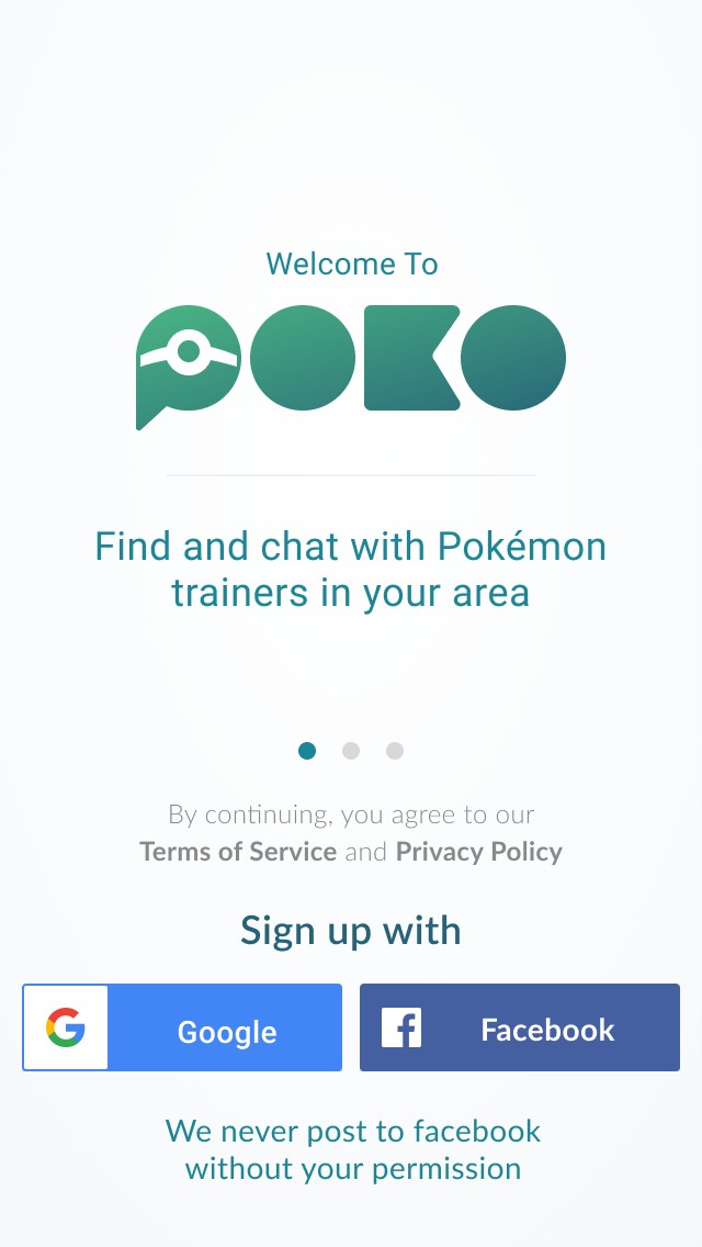
For Poko’s branding, I used a color palette reminiscent of Pokemon Go so that the two apps shared a continuity and users associated the two in their heads. I wanted to keep the branding simple and modern, while also incorporating Pokemon symbolism. I broke the letterforms down to their most basic shapes, allowing the P to utilize negative space and imply the shape of a PokeBall inside a message bubble. I chose Lato for the main typeface because it shared patterns with Pokemon Go’s typeface, while also complimenting our wordmark.


03 Design
Sign Up Flow
We kept the sign up flow simple, so that users could get up and running quickly. Users choose a sign up method, enter their username, and declare their team. We limited sign-up to only google and facebook initially. This allowed us to find your friends and provided a bit of shielding from spam bots and bad-actors.

03 Design
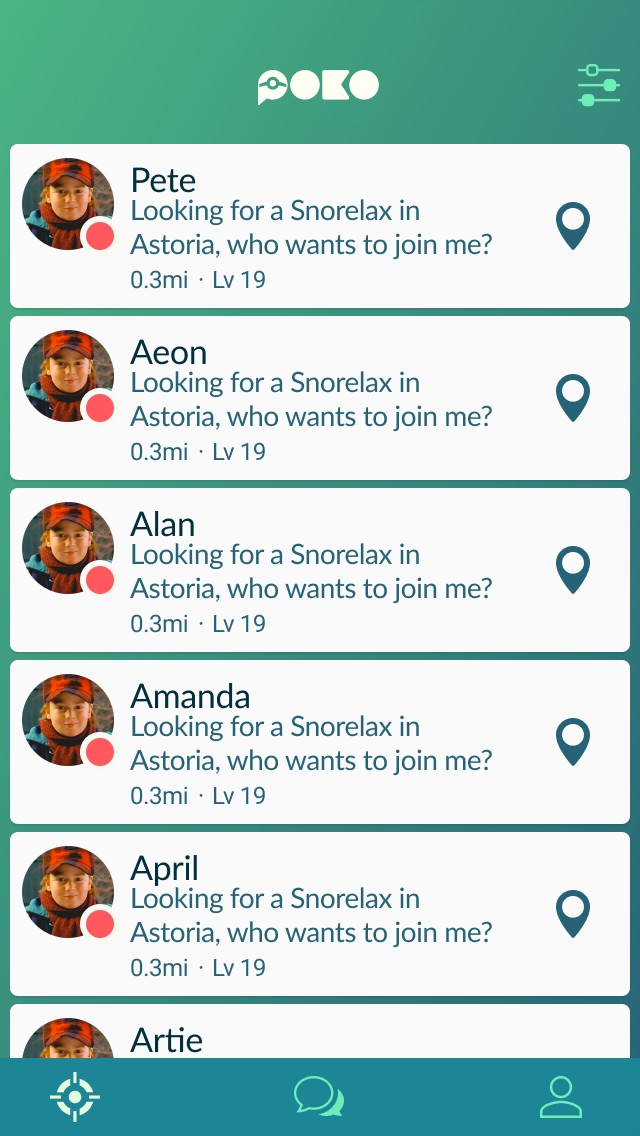
Nearby
Nearby is a local lobby that allows trainers to find each other and coordinate. Users can filter nearby trainers by team and distance. Trainer cards provide quick information like their team, level, and their current status. Tap the pin to quickly send your location to another trainer so you can team up. Swipe left on a card to hide or report a Trainer.

03 Design
Location Based Chat
Keep in touch with your friends and other trainers nearby. Use Poko to plan a meet-up, discuss strategy, or just talk PoGo. You can even share your location so it’s easier for other trainers to find you while on-the-go.


03 Design
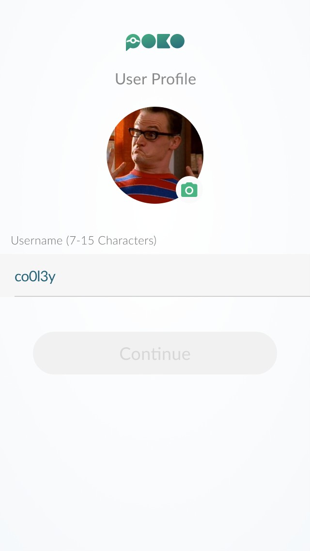
Trainer Profiles
Trainer profiles are simple and to the point so that you can focus on the task at hand – catching Pokemon. Just upload a profile photo and set a status to let other trainers know you’re ready to catch them all!

04 Build/Test/Review
Alright, build it already
Development
The developers and I had been in sync from the beginning, so they had already hit the ground running setting up the basics of the app. I prepared specs and style guides for them to follow. Since we used Ionic, a web-based framework for creating native apps, I was able to help the developers code the front-end UI with HTML and CSS.

04 Build/Test/Review
But, did you learn anything?
Even though it was a side project, at its peak Poko got over a thousand Pokemon Trainers to use the platform. Pokemon Go ended up introducing social features a few years later. The app is no longer in development, but it was a really fun project to work on. It was my first time being involved in the early stages of an app. I learned a tremendous amount about creating an identity, and building a design and UX strategy from the ground up.


- Design direction & system architecture
- Discovery and requirements gathering
- Prototyping & wireframing
- Marketing experience design
- A/B and usability testing
- Project scoping & management

- Lead UI/UX design
- Discovery & requirements gathering
- Prototyping & wireframing
- High fidelity mockups
- A/B and usability testing
- Product scoping & management

- Lead user experience design
- Discovery & planning
- Wireframing, prototyping, & mockups
- Front-End Development (HTML, CSS, Angular)
- Product management
- Data analysis