The Grade

TL;DR 😉
My Role
Senior Product Designer
Date
Aug 2017 - March 2018
Company
Snap Interactive
What I Did
- Lead user experience design
- Discovery & planning
- Wireframing, prototyping, & mockups
- Front-End Development (HTML, CSS, Angular)
- Product management
- Data analysis
Tools I used
Sketch, Photoshop, InVision, HTML, CSS, PHP, Javascript (Angular)
Who Helped Me Do It
Clifford Lerner, David Fox, Robert Brisita, Dirk Heikoop, Jenna Freidman
What's it all about!?
The Grade is a mobile dating app that holds it’s user’s accountable for their behavior by grading users based on various metrics like responsiveness and profile quality. The app then “kicks out the creeps” in an attempt to make online dating safer. Users liked the idea of vetting potential suitors, and treated the grading system like a game competing for the best grade. They wanted to know what went into their grade and how to improve it. We also wanted to find a way for users to provide input into the grading system.
Based on this feedback, we decided to introduce My Grade, Peer Review, and The Leaderbaord. I lead product design and front-end development. The new features increased user engagement 25%, and increased 7-day retention 40%.

01 Discover
So, What's the Problem?
Problem 1:
Users didn’t really understand how grading worked or what gave them a better grade. The algorithm was complex and took into account several factors. We had to find a way to convey this in a user-friendly way.
Problem 2:
Users enjoyed gaming the system and competing for the best grade. How could we foster this friendly competition?
Problem 3:
Users wanted more influence on the grading system. Had a great date with someone from the app? Had a horrible experience and want to warn others? We wanted to find a way for users to provide feedback about their IRL experiences.
01 Discover
Did you do your homework?
User Interviews
I conducted interviews with real users at a few of our singles events in NYC, asking them questions about their experience in the app and what they wanted to see more of. Users often mentioned wanting to know more about their grade, and enjoyed the leaderboard we had set up for the party.
Competitive Analysis & Inspiration
I began researching competitors and other app experiences for inspiration. For My Grade, I focused on dashboard interfaces and how we could visually convey a user’s metrics in a simple way. For the Leaderboard, I took cues from competitive games that ranked their users.
02 Plan
The best laid plans
User Journey and Use-Case mapping
I audited the current user journey, and determined where these new experiences fit in the existing flow. I also mapped different use-case scenarios to understand what user’s would be expecting from this experience to help inform each flow.
Wireframing
Based on my research I started sketching what these new screens and flows could look like. I would then meet with the CEO (who was serving as a Product Manager) to review and collect feedback. After a few iterations, we settled on a rough draft of each feature.


03 Design
Design & Rapid Development
I started fleshing out high-fidelity mockups of the features based on our research and planning. We wanted to iterate on these experiences rapidly once we launched, so the decision was made to create these screens as web-views within the app so we could hot-swap as needed. This brought with it certain design considerations and development constraints which I had to keep in mind.
03 Design
My Grade
My Grade offers users a detailed look into their grade and provides suggestions on how to improve it. To develop this feature I worked with the dev team to better understand our algorithm, and break down exactly what goes into the calculations. Armed with this information and inspiration from various dashboard interfaces, I set out to create an intuitive, informative experience that was easy to digest visually.


03 Design
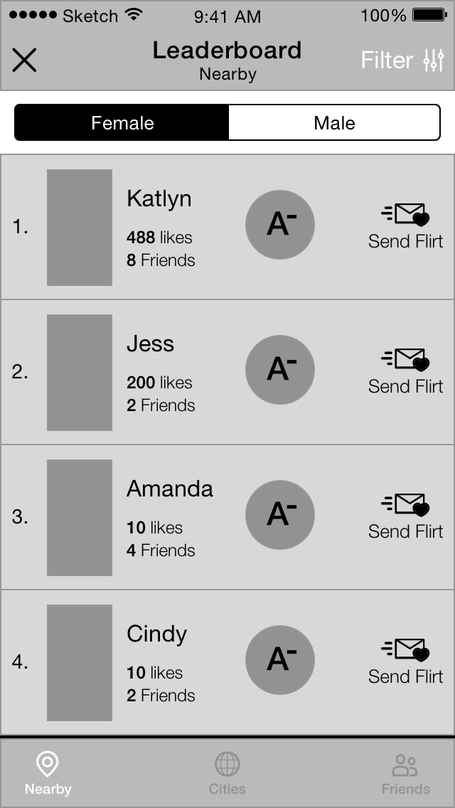
The Leader Board
From our research, we found that users saw the grading system as a game, and enjoyed competing for the best grade. In the spirit of The Grade’s gamification of dating, we set out to create a series of leaderboards for nearby singles, popular cities, and even your Facebook friends who used The Grade. This allowed users to compete with friends, and also served as another way for users to browse singles. Users could then filter by distance, age, and location.


03 Design
Peer Review
One of the inherent dangers of online dating is not knowing if someone you want to meet is legitimate or not. What if a user’s profile reflected feedback from real people either vouching for them, or warning you. Peer Review allows users to directly influence the grading system and provide feedback about their real life experience by answering a series of simple questions. Users ultimately decided if they would endorse someone, and could leave hashtags for that user which could then be displayed on their profile. (Don’t worry, only positive reviews appear on a users profile)


04 Build/Test/Review
Testing 1,2,3...
Development
We wanted to iterate on these experiences rapidly and in real time. Doing this natively was not a viable solution, so we decided early on to build these experiences as web-views within the app. Our team was small (4 people), so I took on the responsibility of developing the front-end while the other two developers focused on the native code and back-end. Using HTML, CSS, and AngularJS I built initial prototypes, worked with the team to refine and finalize them, and then worked with the back-end developer on API endpoints to provide data to the views.
Rapid Iteration
Every week we would review engagement metrics for the new features and across the app to determine if we were meeting our KPI’s and not hurting the general vitals of the app. We would then iterate the experiences based on our findings.
04 Build/Test/Review
The results are in
The new features were a huge success. After a few months of iteration, we saw a 20% lift in engagement on the app, and a 40% increase in 7-day retention rates. Because of our fresh take to online dating and holding users accountable, we also had a lot of press buzz around the features.
Learnings
This was my first experience with “gamification” and building web-based interfaces for a live application. I learned a lot about understanding user’s behavior, and creating triggers to motivate them which has been invaluable in my career. As a team, we learned that although web-views allowed us to rapidly iterate, they sometimes fall short of the native experience.


- Design direction & system architecture
- Discovery and requirements gathering
- Prototyping & wireframing
- Marketing experience design
- A/B and usability testing
- Project scoping & management

- Lead UI/UX design
- Discovery & requirements gathering
- Prototyping & wireframing
- High fidelity mockups
- A/B and usability testing
- Product scoping & management

- Lead UX & Branding design
- Discovery & planning
- Wireframing, prototyping, & mockups
- Front-end development